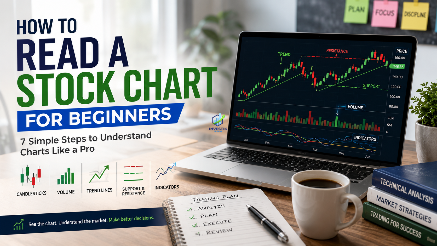

A stock chart is a picture of every decision buyers and sellers have made about a stock’s price over time. Once you know what you’re looking at, that picture tells you far more than a headline or a stock tip ever will.
This guide breaks down how to read a stock chart for beginners, step by step: the axes, the candlesticks, the volume bars, the trend lines, and the handful of indicators that actually matter when you’re starting out. It applies whether you’re looking at a chart on the NSE, the NYSE, the LSE, or any other exchange; the mechanics are identical worldwide.
If you’re new to markets generally, it helps to first understand how the stock market works and how a stock exchange functions before diving into charts. This piece assumes you already know what a share is and picks up from there.
What a stock chart actually shows
A stock chart plots a stock’s price on the vertical (y) axis against time on the horizontal (x) axis. Every point on that chart represents a real trade: someone bought, someone sold, and they agreed on a price.
Charts exist because price alone, as a single number, hides information. A stock at $50 today tells you nothing about whether it was $80 last month or $20 a year ago, how fast it’s moving, or whether trading activity is picking up or drying up. A chart shows all of that at once.
Three things sit on every standard chart:
- Price axis (usually the right or left side) shows the price range for the visible period.
- Time axis (bottom) shows the period covered: a day, a year, five years.
- Volume bars (bottom panel) show how many shares changed hands in each period.
Most charting platforms TradingView, Yahoo Finance, your broker’s app, Google Finance display these the same way, so the skills here transfer across tools.
Line charts vs. bar charts vs. candlestick charts
There are three common chart types, and they show the same data with different levels of detail.
Line charts connect the closing price of each period with a single line. They’re the simplest chart type and the easiest to read at a glance, but they hide everything that happened during each period: the highs, the lows, the opening price.
Bar charts (OHLC charts) use a vertical line for each period’s price range, with a small tick on the left for the opening price and a tick on the right for the closing price. OHLC stands for open, high, low, close the four data points every bar or candle represents.
Candlestick charts show the same four data points as a bar chart but in a format that’s easier to scan quickly. This is the format most active investors and traders use, and it’s the one this guide focuses on.
| Chart type | Shows | Best for |
| Line chart | Closing price only | Quick trend overview, long time frames |
| Bar chart (OHLC) | Open, high, low, close | Detailed price action, less visual |
| Candlestick chart | Open, high, low, close | Pattern recognition, most widely used |
Reading a single candlestick
A candlestick has two parts: the body and the wicks (also called shadows).
- The body is the thick rectangular part. It shows the range between the opening price and the closing price for that period.
- The wicks are the thin lines above and below the body. They show the highest and lowest prices reached during that period, even if the price didn’t close there.
Colour tells you direction. On most platforms:
- A green (or white) candle means the closing price was higher than the opening price; the stock gained during that period.
- A red (or black) candle means the closing price was lower than the opening price; the stock lost ground during that period.
A single candlestick, on its own, tells you four numbers: open, high, low, close. A tall body with short wicks means the price moved strongly in one direction with little resistance. A small body with long wicks means buyers and sellers fought hard and the price ended up close to where it started.
Common single-candle patterns
| Pattern | What it looks like | What it suggests |
| Doji | Tiny or no body, long wicks both sides | Indecision between buyers and sellers |
| Hammer | Small body near the top, long lower wick | Possible reversal after a downtrend |
| Shooting star | Small body near the bottom, long upper wick | Possible reversal after an uptrend |
| Marubozu | Full body, little to no wick | Strong, one-sided conviction |
A single candlestick pattern is a clue, not a conclusion. Reliable signals come from combining candles with the trend, volume, and support/resistance levels covered below, not from one candle in isolation.
Choosing a timeframe
Every chart is drawn on a timeframe: each candle can represent one minute, one hour, one day, one week, or one month. The right timeframe depends on your goal, not on what “looks right.”
- Long-term investors typically use weekly or monthly candles to see multi-year trends without getting distracted by daily noise.
- Swing traders (holding positions for days to weeks) commonly use daily charts.
- Day traders use minute-based or hourly charts, since they’re acting on price movement within a single session; this is the core of learning how to read stock charts for day trading specifically.
A useful habit: check the same stock on two timeframes before acting. A daily chart might show a stock breaking out, but the weekly chart might show it’s still inside a long-term downtrend. Zooming out prevents overreacting to short-term noise.
Volume: the second half of the story
Volume shows the number of shares traded during a given period, plotted as a bar chart beneath the price chart. Price tells you what happened; volume tells you how convinced the market was.
A few rules of thumb:
- Price rising on high volume a genuine, well-supported move. More participants agree with the direction.
- Price rising on low volume a weaker move, more prone to reversing.
- Price breaking a key level on high volume is a stronger signal that the breakout is real, not a false move.
- A price spike with no volume increase is often noise, or a small number of trades pushing price around thin liquidity.
Volume is why two stocks that look identical on a price chart can behave completely differently going forward. The one with rising volume behind its move has more participants backing it.
Trend lines: the first tool to learn
A trend line connects a series of price points to show the general direction a stock is moving.
- An uptrend is a series of higher highs and higher lows. Draw a line connecting the lows; as long as price stays above that line, the uptrend is considered intact.
- A downtrend is a series of lower highs and lower lows. Draw a line connecting the highs; as long as price stays below it, the downtrend holds.
- A sideways trend (also called consolidation or a trading range) shows no clear higher-highs or lower-lows pattern; price oscillates between a ceiling and a floor.
Trend lines need at least two points to draw, and a third point to confirm a line touched only once is a guess, not a trend.
Support and resistance
Support and resistance are price levels where a stock has repeatedly stopped, reversed, or paused.
- Support is a price level where buying pressure has historically stepped in, stopping a decline.
- Resistance is a price level where selling pressure has historically stepped in, stopping an advance.
These levels form because market participants remember prices. If a stock bounced at $40 three times, traders start watching $40 again, and that expectation itself becomes part of what makes $40 hold until it doesn’t.
When price breaks through resistance, that old resistance level often becomes new support (and vice versa when support breaks). This flip is one of the more reliable, widely observed patterns in price behaviour, which is part of why support and resistance remain a starting point for chart reading even among traders who use much more advanced tools.
Chart patterns worth knowing
Beyond single candlesticks, price tends to form recognisable shapes over multiple periods. These are the patterns most beginner guides to stock chart patterns cover first:
Head and shoulders: three peaks, with the middle peak highest. Often signals a trend reversal from up to down. An inverse head and shoulders (three troughs, middle lowest) can signal a reversal from down to up.
Double top / double bottom: price tests a level twice and fails to break through (double top) or fails to break down (double bottom). Suggests the trend may be running out of strength.
Triangles (ascending, descending, symmetrical): price consolidates into a narrowing range before typically breaking out in one direction. The direction of the prior trend often, but not always, indicates which way the breakout goes.
Flags and pennants: brief pauses after a sharp price move, usually followed by a continuation in the same direction.
Patterns are probabilities, not guarantees. They describe how a stock has tended to behave in similar setups historically; they don’t predict what a specific stock will do next with certainty.
Basic indicators to add on top of price
Once you can read raw price and volume, a small number of indicators add useful context. You don’t need more than two or three to start.
Moving averages smooth out price by averaging it over a set number of periods (commonly 50-day and 200-day). When a shorter moving average crosses above a longer one, it’s called a “golden cross” and is often read as bullish. The reverse, a “death cross,” is often read as bearish. Moving averages also act as dynamic support and resistance; many stocks bounce off their 50-day or 200-day average repeatedly.
Relative Strength Index (RSI) measures how fast and how far price has moved recently, scaled from 0 to 100. Readings above 70 are traditionally considered overbought; below 30, oversold. RSI works best as a warning sign, not a standalone buy or sell trigger.
Moving Average Convergence Divergence (MACD) compares two moving averages to show momentum shifts. When the MACD line crosses above its signal line, momentum is turning positive; crossing below suggests the opposite.
| Indicator | What it measures | Typical use |
| Moving average (50/200-day) | Average price over time | Trend direction, dynamic support/resistance |
| RSI | Speed and size of recent price moves | Overbought/oversold conditions |
| MACD | Relationship between two moving averages | Momentum shifts |
A step-by-step process for reading any chart
- Check the timeframe. Confirm you’re looking at daily, weekly, or intraday candles; the same chart looks completely different depending on this setting.
- Identify the trend. Are highs and lows rising, falling, or flat?
- Mark support and resistance. Look for price levels that have been tested more than once.
- Check volume. Is recent price movement backed by higher-than-average volume, or is it quiet?
- Look for patterns. Is price forming a recognisable shape near a key level?
- Layer in one or two indicators. A moving average for trend, RSI for momentum don’t stack five indicators that all measure similar things.
- Zoom out. Check a longer timeframe to see whether the short-term picture agrees with the bigger one.
This same sequence works whether you’re evaluating a stock before a long-term investment or checking a setup intraday.
Numeric example: reading a real setup
Say a stock has traded between $95 and $105 for six weeks, a sideways range, with $95 acting as support and $105 as resistance. On the seventh week, it closes at $108 on volume 2.5 times its 20-day average.
Reading this step by step: the range breakout above $105 is the trend signal. The volume spike (2.5x average) suggests real participation, not a thin, low-conviction move. If the stock’s 50-day moving average is also sloping upward and sits below the current price, the medium-term trend supports the breakout rather than contradicting it. Together, these three factors level, volume, and trend are what separates a breakout worth watching from a random one-day spike that fades back into the range.
None of this guarantees the stock keeps rising. It’s a description of what the chart is showing, not a prediction. Chart reading estimates probability; it doesn’t remove risk.
Common mistakes beginners make
- Reading one indicator in isolation. RSI alone, or one candlestick alone, rarely tells the full story. Combine signals.
- Ignoring volume. A price move without volume behind it is often noise.
- Using the wrong timeframe for the goal. A long-term investor reacting to a five-minute chart will make short-term decisions for a long-term account.
- Forcing patterns onto random price movement. Not every wiggle is a head and shoulders. If a pattern needs heavy imagination to see, it’s probably not there.
- Treating technical analysis as certainty. Charts describe probability and market psychology; they are not a guarantee of future price direction. Position size and risk management still matter more than any single pattern; a position size calculator is a practical way to keep any single trade from doing outsized damage to a portfolio.
- Skipping fundamentals entirely. A chart shows what the price has done. It doesn’t show revenue, debt, or competitive position. Most experienced investors combine chart reading with fundamental research rather than relying on either alone.
Chart reading for investors vs. day traders
The mechanics are the same; the application differs.
Long-term investors mainly use charts to check entry timing, avoid buying into an extended downtrend, and monitor major support and resistance zones on weekly or monthly views. Chart reading is a secondary tool here; company fundamentals usually drive the decision.
Day traders, learning how to read stock charts for day trading specifically, rely on charts as the primary decision-making tool, working on much shorter timeframes (1-minute to 15-minute candles), with volume, intraday support/resistance, and momentum indicators like RSI and MACD doing most of the work, since there’s no time for fundamentals to play out within a single session.
Neither approach is “correct”; they solve different problems over different time horizons.
Where charts fit with everything else
A chart shows price and volume history. It doesn’t show why a company’s earnings grew, whether its debt load is sustainable, or how its industry is changing. Understanding order types market orders, limit orders, stop-losses matters just as much as chart reading once you’re ready to act on what a chart is showing you, since a stop-loss set near a support level, for example, is a direct application of the concepts covered above.
It also helps to know the broader market backdrop: whether the overall market is in a bull market or a bear market shapes how much weight to give an individual stock’s chart pattern. A bullish setup in a stock during a broad bear market carries different odds than the same setup during a bull market.
If you’re holding a position across multiple purchase prices, a stock average calculator is useful alongside chart levels to know your actual breakeven point relative to current support and resistance.
For unfamiliar terms along the way, the market glossary covers standard definitions in plain language, and the broader stock market category on Investik Future has related guides on market structure and mechanics.
Frequently asked questions
What’s the easiest way to start reading stock charts as a complete beginner?
Start with a daily candlestick chart on one stock you already know. Identify the trend direction, mark the two or three most obvious support and resistance levels, and check whether volume is rising or falling on recent moves. Master that before adding indicators.
Do candlestick patterns actually work?
They describe historical tendencies in price behaviour, not certainties. Treat them as one input alongside trend, volume, and support/resistance rather than a standalone signal.
How many indicators should a beginner use at once?
One or two is enough; for example, a moving average for trend and RSI for momentum. Stacking many indicators that measure similar things (momentum, in particular) tends to create confusing, contradictory signals rather than added clarity.
Is chart reading different for stocks versus other assets?
The core mechanics candlesticks, volume, trend lines, support and resistance apply the same way across stocks, ETFs, indices, and most other traded instruments. What differs is typical volatility and trading hours.
Can chart reading alone tell you whether to buy a stock?
No. Charts show price history and current momentum; they don’t show a company’s financial health. Most disciplined investors combine chart reading with fundamental analysis of earnings, debt, and competitive position rather than relying on either alone.
Conclusion
Reading a stock chart comes down to a small set of repeatable skills: recognising candlesticks, tracking the trend, marking support and resistance, checking volume, and layering in one or two indicators for confirmation. None of it requires predicting the future; it’s a structured way of reading what price and volume have already told you, so you can make better-informed decisions going forward.
Start with one stock, one timeframe, and the basics above. Add complexity only once the fundamentals feel automatic. For the broader mechanics behind what moves these charts, the Investik Future homepage has further guides on markets, mutual funds, and personal finance to build on this foundation.
Related reading
- How the Stock Market Works: A Beginner’s Guide
- Stock Exchange Explained: How It Works and Types
- Types of Orders in Stock Trading
- Bull Market vs. Bear Market: Key Differences
External references
- U.S. Securities and Exchange Commission Investor.gov
- National Stock Exchange of India (NSE)
- Investopedia Technical Analysis
- CFA Institute Investor education resources
ARN Disclosure: Investik Future is an AMFI-registered Mutual Fund Distributor. ARN-341107 — Verify on AMFI ↗. Komal Thakur is the content author and digital marketer; the ARN registration belongs to Investik Future, not to the author personally.